Magics (Meteorological Applications Graphics Integrated System), ECMWF’s software library specifically designed for data visualisation, has undergone substantial change since its initial release in 1985. This article aims to provide a history of Magics and highlights how Magics has continually adapted to meet the needs of scientists, specifically in terms of generating high-quality weather maps, effectively handling the ever-increasing data resolution, and adopting new standards and technologies. The article concludes with an exploration of current challenges and how Magics will evolve into the visualisation component of ECMWF’s ambitious new open-source project, earthkit.
The 1980s – bringing colour to weather maps
The visualisation of forecasts and observational data is vital to be able to comprehend the vast amounts of data involved in developing and operating a forecast model. Therefore, ECMWF invested from the beginning in good visualisation facilities to allow scientists and users alike to work with and develop the forecast model and analyse their results: two-dimensional maps for the forecasts and graphs for some other data. In the 1980s, this meant mainly printed maps, as computer screens were mostly too low-resolution to display large and complex maps. One focus of Magics development was to make extensive use of colours to allow the overlay of different parameters on maps.
From the beginning, developers acknowledged the necessity of creating an easily expandable solution, foreseeing increasing demands and requests from users. However, during the early 80s, expanding a user interface (API) commonly involved adding parameters to subroutines. Recognising the inherent difficulties in maintaining this approach, the Magics team made a deliberate decision to pursue an alternative strategy. They opted to maintain a concise list of subroutines while providing an extensive set of parameters. This design choice empowered users to customise their plots effectively and streamlined the documentation process.
The first plot ever produced by Magics was the metgram, which helped users to see the evolution of key weather variables for particular locations. At that time, an open-source solution was not viable. Instead, Member States financed the development of software by ECMWF to support their daily work. Magics itself relied on CONICON, a contouring package that required a paid licence. This algorithm was necessary to generate smooth lines, despite the low resolution of the data at that time. Magics was one of the first software packages able to visualise the new emerging World Meteorological Organization (WMO) standards for gridded forecast data and observations, GRIB and BUFR. Figure 1 shows an early example of the output provided by Magics.

In 1993, Magics became the graphical kernel of Metview, the ECMWF workstation for researchers. For the first time, scientists could quickly visualise data on their screen, zoom in on specific areas, interactively select lines to perform further actions, such as visualising cross sections, and see the value of fields below their cursor.
Early 2000s – adaptation to the web & Python
In the early 2000s, it became clear that key technologies around the creation of weather maps had changed. The model resolution was increasing fast, Metview was more widely used, the web and large screens had replaced printers as the main medium to present maps (see Figure 2 for examples of working with printed maps and computer screens). At the same time, users moved their data analysis and visualisation work away from Fortran to Python and web services. Combined with the fact that Magics had been mainly written in Fortran and became harder to maintain, the decision was made to rewrite Magics in C++ and offer additional interfaces to C, Python, XML and JSON to create plots. To smooth the migration, it was decided to ensure backward compatibility with the previous API and preserve the concept of a limited number of action routines enhanced by a comprehensive set of parameters. As a temporary name, 'Magics++' was adopted to differentiate itself from earlier versions. CONICON was abandoned in favour of a freely available algorithm, which opened the door to the journey towards open-source development, making Magics one of the first ECMWF software packages distributed under the open-source Apache Licence in 2005.

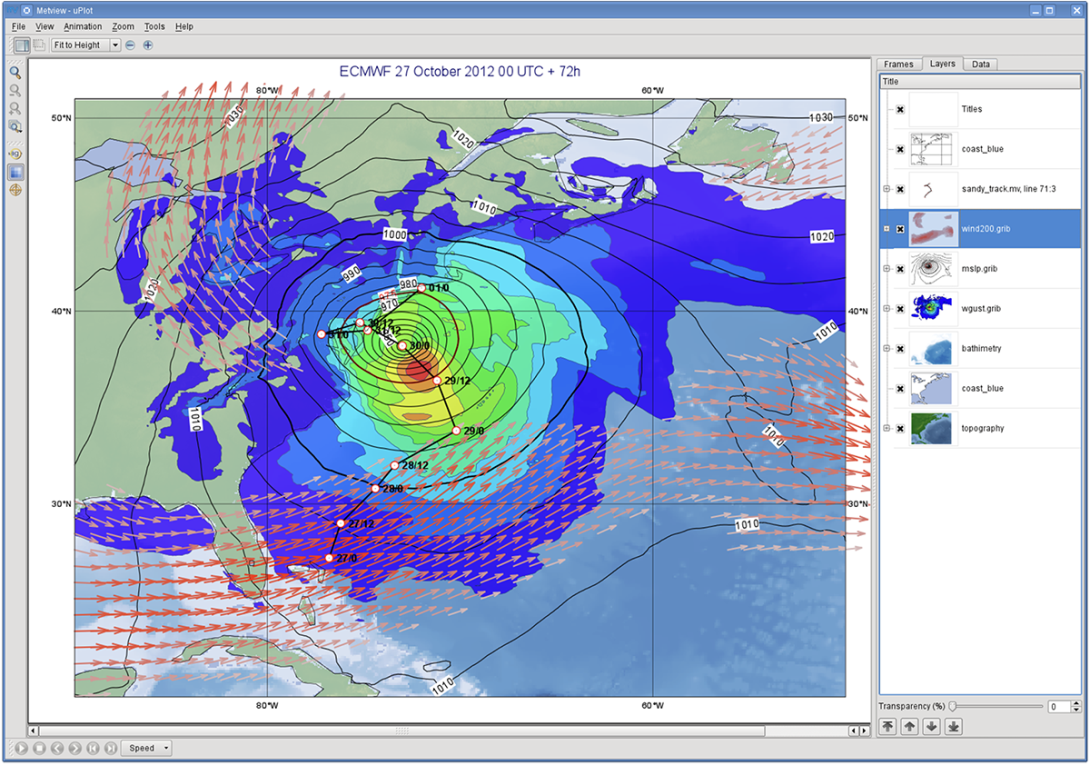
The rewrite offered the possibility to incorporate additional features, such as support for NetCDF and ODB (ECMWF’s own format to handle observational data), inclusion of political boundaries, and the implementation of thermodynamic diagrams. Moreover, new graphical formats like PNG, PDF or SVG were introduced. Magics was for the first time using an external open-source library, cairo, to generate these different formats. A new Python interface was implemented, aligning with the philosophy of the Metview macro language favoured by users at that time. Figure 3 shows an example of a weather plot shown by Metview.

The new version became the graphical kernel of ecCharts, a highly interactive web application for weather forecast data developed in 2010. This time, users gained the ability to zoom in and pan across the latest forecast in their native resolution directly within their web browser. Today, ecCharts provides on-demand visualisation for over 250 parameters, i.e. more than 2 TB of forecast data every day. To enable this, significant optimisation efforts were undertaken, and an extensive list of styles was created. Subsequently, this library of styles was ported back to Magics, enabling the automatic selection of an appropriate visualisation based on metadata. This automatic styling feature is extensively used in SkinnyWMS, a lightweight implementation of an Open Geospatial Consortium (OGC) Web Map Service standard. This lightweight implementation can identify GRIB or NetCDF data and allows users to quickly visualise, zoom, and pan through their data. This functionality can be particularly valuable when working in a JupyterLab environment.
The 2020s – new challenges
However, the landscape has changed, and today Magics faces new challenges. Meteorology has expanded to encompass a broader community, including the fields of climate and oceanography. To foster collaboration and exchange within this larger community, there is a need for a shorter learning curve to be able to create complex visualisations, and a shift towards a more pythonic approach. Recognising these evolving requirements, the next Magics generation will address these needs by offering an intuitive interface that empowers newcomers to interact more seamlessly and effectively with the rest of the community.
To achieve this, the new Magics will be the visualisation component of earthkit, an exciting new open-source project led by ECMWF. As a successor to Metview, earthkit will provide powerful and convenient Python tools for speeding up weather and climate science workflows by simplifying data access, analysis and visualisation. The geospatial visualisation component of the project, earthkit-maps, will provide the extensive range of features offered by Magics through a new Python API, and will be built upon a new backend based on well-established open-source packages like matplotlib and Plotly. This shift toward widely adopted tools will ensure compatibility and ease of integration within the data visualisation ecosystem.
Just like the current version of Magics, earthkit-maps aims to provide an extensive range of features to facilitate the visualisation of meteorological and climate data.
Maintaining a delicate balance between speed and high quality, earthkit-maps will continue to deliver efficient rendering without compromising on visual output. To achieve this, earthkit-maps will take advantage of MIR, the ECMWF Meteorological Interpolation and Regridding package, enabling it to select the most suitable interpolation technique. This approach effectively reduces the data size while preserving essential details, resulting in optimised visualisations. By default, the geographical area will fit the specific domain of the data, and an automatic styling mechanism, imported from Magics, will select the most appropriate visualisation techniques based on the data characteristics. This will ensure that the visualisations are both meaningful and informative. Earthkit-maps will continue to offer a wide range of convenience features such as automatic titles, layouts and labels based on metadata, while also providing full user freedom to customise visualisations with ease.
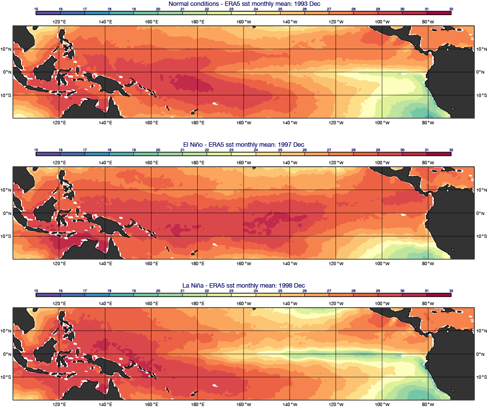
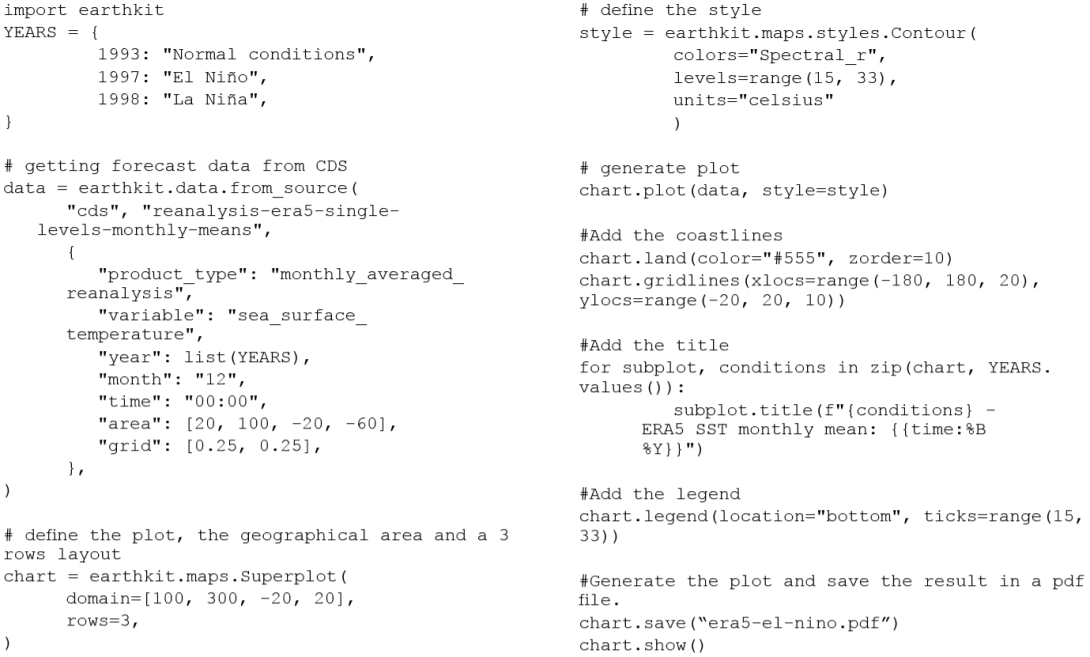
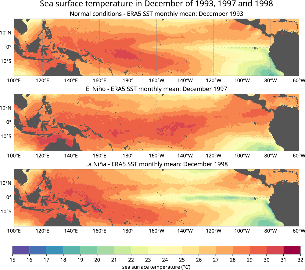
Based on well-established packages, the transition to earthkit-maps is designed to be smooth for Python users. And support will be provided to existing Magics and Metview users to facilitate their migration process. To assist with this transition, dedicated Jupyter notebooks will be created, reproducing the Magics and Metview example galleries. These notebooks will serve as practical examples, showcasing the capabilities of earthkit-maps. In addition, comprehensive guidelines will be developed to provide step-by-step instructions for Magics and Metview users looking to migrate to earthkit-maps. These guidelines will outline the necessary steps, highlight key differences and improvements, and help users leverage the full potential of earthkit-maps. Figures 4 and 5 provide examples of the code to produce weather maps using the current version of Magics and earthkit-maps, respectively.


Conclusion
Magics has evolved from its early days as an expandable tool with a unique approach to parametrization. It has overcome challenges related to data resolution and licensing, and it now faces new challenges in accommodating a larger community while ensuring a seamless learning curve and compatibility with other open-source packages. With its continued focus on ease of use and automatic data understanding, earthkit-maps will be an asset in the field of data visualisation. It is currently in the beta stages of development with a release target of 2024.
